When I was a sophomore in college, I moved into my first apartment in downtown Chicago. It was in an old brownstone building that had been broken up into multiple units. Unfortunately, my bedroom was only about nine feet by 10 feet, a space far too small to hold my grand expectations. To make matters worse, it didn’t even have a closet. Who knows, at one point in the building’s history, it may have been the closet. The one saving grace was the ceiling height—almost 14 feet.
After evaluating the space for a few days, I decided to build a frame from two-by-fours that I wedged into the room so I could vault my full-size bed over the door. This created a six-foot-wide space underneath the bed where I could mount a bar and create a curtained-off closet. I was even able to add bookshelves and a chair to the room. To this day, despite the challenge of climbing a seven-foot, built-in ladder every night to go to bed, this was one of my favorite living spaces ever.
So, what does this trip down memory lane have to do with designing seasonal events? EVERYTHING! I was able to “right-size” my needs to fit the space available. Designers for events, installations, and festivals need to do the same thing.
Tiny Space, Big Idea
Want to put a castle in a cupboard? It may not be possible, but don’t let limited square footage deter your grand plan. Let the space inspire it.
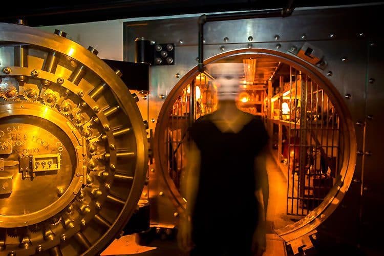
First, look at what already exists. When I first started working on The Vault of Souls—an immersive theatre piece based on spirits from the 1920s trapped in the basement of a bank—I spent many hours walking around the location. I created characters and scenes based on the existing rooms and elements—the most obvious of which was the original bank vault. The door alone weighs 18 tons, and the vault is surrounded by three to four feet of concrete and steel, so even the atmospheric pressure changes when you walk inside. I had to use this space. It was too amazing to ignore.
So, I created the character of the bank guard who went blind before he died. In the afterlife, he’d grown eyes in the palms of his hands so he could continue his mission. All we needed to do to the space was dress it with props and add a triggered subwoofer to make the walls rumble on command. All of this was inspired by the existing room and required minimal effort to execute. It would have made no sense for us to try to create some other scene in this location.
Now, some of you may be saying, “But all I have are pipes and exposed ductwork, and they don’t fit with my medieval-fantasy escape room.” This is a valid point. Ask yourself, “What could I do to transform that ductwork into something that would belong within the story I’m trying to tell?” Let your imagination run free, and try to look at the room the same way a child would. This ductwork might transform into a dragon’s tail bursting through the ceiling and out the side wall. With a little bit of sculpting and carpentry, you could make this real eyesore into an integral part of the fantasy you’re trying to create. Coming from a place of abundance versus a place of scarcity can spark new and cost-effective ideas. Create your design based on what you have instead of wishing for things you don’t.
Another approach when dealing with limited space is changing perspective. There are times we want to tell stories that take place in large, open rooms, but we don’t have them available. One way to tackle this issue is to relocate the guests, so they’re not in a huge arena but still feel as though they’re part of that large scene.
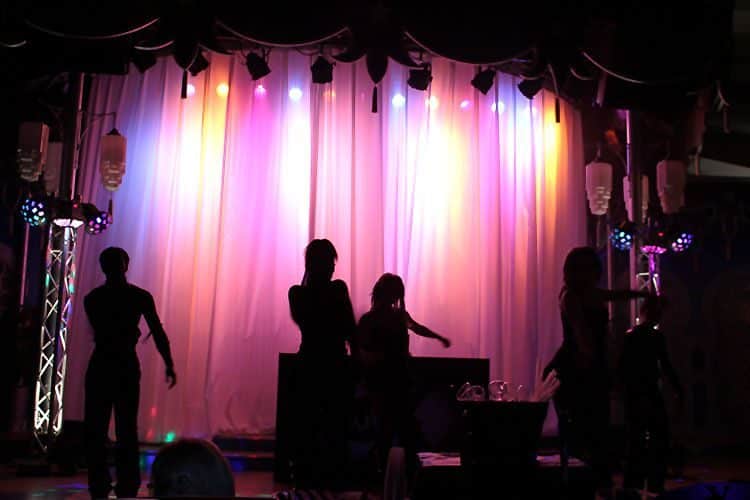
An attraction I worked on for Busch Gardens Howl-O-Scream in 2010 was based on an iconic character—the “dangerous rocker chick.” The whole house was a journey through her terrifying backstage world. Near the end, I wanted to create a concert scene in a huge stadium. This wasn’t possible, so I changed the guests’ perspective. Instead of setting the scene in the concert venue, I walked the guests “behind the stage” – a narrow hallway with a large white curtain on one side and a brick wall on the other. The amazing audio-visual team was able to rear project the “shadow” of the band performing onto the curtain and reinforce the illusion with loud music and crowd noises. This made the guests feel as though they were just a few feet from a raging rock concert without having to create a massive stadium. By changing the patrons’ point of view, we were able to tell our story within the space we had.
Limited space not only impacts the creative process but can also present some operational issues. This is where decisions must be made regarding quality and quantity. Small footprints are often not conducive to high-attendance experiences, so focus toward a high-quality, low-attendance business model. In this model, you invest in creating a top-notch experience for a limited number of people. The higher quality can command a higher ticket price. This will, in theory, compensate for the lower throughput.
You’ll also want to consider proper queueing space and, perhaps, multiple staging areas outside of the attraction. The additional areas may seem like “wasted space,” but remember, the queue is the guests’ first impression of your event or attraction. If it’s crowded, uncomfortable, or disorganized, they’ll enter the actual show displeased.
One final area of discussion for the small-space attraction is infrastructure. Make sure you take into account the space needed for audio and lighting control, actor dressing rooms, and behind-the-scenes access. Most successful haunted attractions and holiday walkthrough experiences have centralized, dedicated rooms for lighting dimmers and audio racks. These spaces should be accessible from the outside of the attraction but integrated enough to make cable and power runs possible. You want to try to avoid making the only entrance to these locations within the guest experience. When (not if) something goes wrong, you need immediate access so you can fix the problem.
Dressing rooms don’t necessarily need to be within the walls of the attraction, but remember, the closer they are, the less time it takes to get the cast in place before the event begins each night. It will also help them make the most of their well-deserved breaks during operational hours. Behind-the-scenes access is essential not only for staff access to various locations but in emergency situations. My personal favorite design is to have a central hallway that runs down the middle of the attraction. This gives supervisors and first responders a way to quickly access any room. Keep these ideas in mind as you are carving up your limited footprint.
Critical Mass
The opposite of having too little space is having too much. The abundance of space may not sound like a real problem, but it can affect the guest experience and present some unique operational issues.
Google Dictionary defines critical mass as, “the minimum size or amount of something required to start or maintain a venture.” Regarding festivals and events, I like to think of this as the minimum amount of product or engagement per square foot needed to capture and keep the guests’ attention. For example, last year I was working on the Halloween event Dark at Fort Edmonton Park in Edmonton, Alberta, Canada. Fort Edmonton Park is a large, outdoor history museum during the day. For the seasonal nighttime event, we decided to use less than half of the available space. The concentration of the three haunted houses, show, movie experience, bonfires, and atmospheric entertainment made the event significantly more impactful to the guests. They never had the opportunity to “walk out of the experience.”
Think of it this way: 25 gallons of water may seem like a lot, but not when you pour it into an empty Olympic-sized swimming pool. Make sure there’s always enough product to keep your guests engaged and entertained.
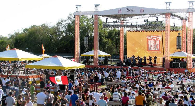
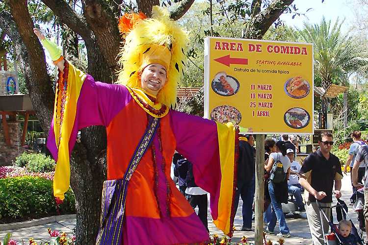
Music-based events are another example of critical mass. A concert alone isn’t enough. The festival should surround the guests and build to the moment of their favorite artist taking the stage. When we first started doing the Latin-themed concert series, Viva la Musica, at Busch Gardens in Tampa, we decided to limit all of the activities to the plaza surrounding the concert field. We filled the space with appropriate food and merchandise vendors. We even added a second, smaller stage to host local Hispanic musical groups. We also changed the park music to match the event in that area. This approach served the project very well. We were able to give the Spanish-speaking guests an immersive event that met and exceeded their expectations while offering other guests the opportunity to sample a different culture and then move on with their theme park experience. If we’d tried to spread the same amount of product throughout the park, we would have failed on both fronts. The headliners were the reason for people to come, but the concentration of supporting elements helped create the critical mass needed to make the festival a success.
Allow Room for Expansion or Concentration
Right-sizing an event or festival isn’t an exact science. You may discover your market can’t support a massive Arbor Day celebration, or EVERYONE wants to attend an ‘80s Music Festival. No matter how much planning you do, the only real data comes from the event itself, so BE FLEXIBLE.
- Plan attractions so they can quickly and economically expand or contract.
- Know how to access additional parking if you need it.
- Plan to relocate your atmospheric entertainment when you discover your traffic flow is nothing like you expected.
- Ensure that additional stanchions are easily accessible on Saturday nights.
The rules of supply and demand are obvious in the world of events and festivals.
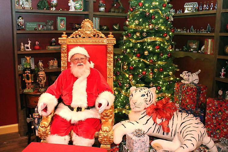
My final example: Welcome to Santa’s House at ChristmasTown in Tampa. The adventure included helping the elves decorate Santa’s tree, a quick stop in Mrs. Claus’ kitchen for a cookie, and then off to meet the big guy himself. We knew it would be popular, but we had no idea how popular. The original design included two offices for Santa Claus to meet his young fans. We thought this would be sufficient. On the first night of the event, we discovered how wrong we were. The house was overrun, and the queue was unacceptably long. Before we opened again, we hastily added a third “office,” and, before the end of the run that year, we had plans to add a fourth. (Thank goodness we’d included ample behind-the-scenes space in the original design.) In the second season, the footprint was completely redone to include six offices to accommodate the eager families wanting to meet St. Nick and share their holiday wishes.
Whether you’re furnishing your first apartment or designing a multi-million-dollar festival, take the time to evaluate your space and your assets. Use what you have for either an element or an inspiration. Provide enough concentrated entertainment, so your guests experience critical mass. Prepare to adjust the elements as needed. Know that when it comes to making design and operational choices about your event…size matters.
